A Guide to Creating Popups
- alert
- confirm
- css
- dialog
- html
- javascript
- modal
- popover
- popup
- prompt
Popups
This article outlines various techniques that developers can employ to create accessible popups using HTML, CSS, and JavaScript.
I’m going to refer to modals, popovers, and dialogs as popups. Generally, it’s best to avoid popups altogether–they can be obtrustive, especially when they aren’t accessible. Popups can be used when an application needs to alert a message, obtain confirmation, or prompt the user for input. If these cases sound familiar, they are!
The case for alert, confirm, and prompt
Overview
The window object has three methods to perform these actions: alert, confirm, and prompt. Using any of these three methods makes it easy to ensure the user is always provided with an accessible popup catered to their device, whether it be mobile, desktop, or AR/VR.
If a custom user interface is not needed, developers can utilize the web platform with these methods and provide users with a familiar experience.
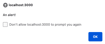
Alert
alert("An alert!");


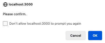
Confirm
The confirm method returns a boolean. It displays a popup with buttons to cancel or confirm.
const confirmation = confirm("Please confirm.");


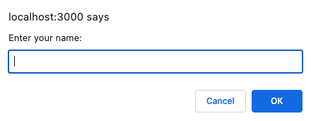
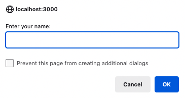
Prompt
The prompt method returns a string or null. It displays a popup with an input field for the user to enter text.
const name = prompt("Enter your name:");


Advantages
These methods have a few advantages over creating your UI elements.
- Simple - just one line of code
- Accessible - render appropriately regardless of the user’s device
- Ability to disable - if users do not want to receive alerts from certain websites, these can be disabled for a particular domain
- Platform - the interface is auto-updated by the browser or device
Disadvantages
- No custom styles - they can make your website look less polished
- Text-only - for example, you can’t add an
<img>or a<select>element into an alert - Requires JavaScript - most popups rely on JavaScript, see popover below for an HTML only option
Custom content and styles
So what if you have a design system you need to follow, or need some other content besides text and a text input inside your popup? You can always create a component with just a <div> and CSS, but there are a couple of happy paths to accomplish this using built-in HTML elements and attributes. These make it easier to provide an accessible experience across devices.
Dialog Element
Overview
The HTML <dialog> element, is supported across all major browsers. Dialogs are best used if the user is required to take an action before proceeding. For example, an “Are you sure you want to delete this record?” confirmation would be a use case for a dialog.
The HTMLDialogElement JavaScript object comes with a couple of useful methods, showModal can be used to show the dialog, while close is used to hide it.
Another way to close the dialog is to add method="dialog" to a <form> or formmethod="dialog" to a <button> that is contained within the <dialog> element.
There is also an open HTML attribute that can be utilized to control the visibility of the element. Add it to the <dialog> element to make it open by default on page load.
Code / Preview
<!-- Dialog.svelte -->

<script lang="ts">
	let dialog: HTMLDialogElement;
</script>

<button onclick={() => dialog.showModal()}>Show Dialog</button>

<dialog bind:this={dialog}>
	<p>A dialog element</p>
	<div>
		<form method="dialog">
			<button>Close with method="dialog"</button>
		</form>
		<button onclick={() => dialog.close()}>Close with .close()</button>
	</div>
</dialog>
Defaults
- Not put in the top layer by default
- Disables the rest of the page
- Clicking outside the dialog does not close it
- Can be closed with the
ESCkey - Gray overlay/backdrop is applied to the rest of the page
Advantages
- Custom styles - using the dialog element is a great way to take advantage of the web platform while also maintaining the freedom to customize the look and feel of the popup.
- Accessible - while you still need to ensure you are creating accessible content, utilizing the built-in defaults helps reduce the amount of code written and edge cases that need to be considered
Disadvantages
- Requires JavaScript - as of June 2023, dialog elements can’t be opened without JavaScript. While you can default the state to open upon load, there is not currently a way to open the dialog without JavaScript if it is already closed. Read the latest discussion on this here: Have some way of opening
<dialog>elements without JavaScript. - More code - it does take more effort and code to create a dialog element than using the built-in
windowmethods, and the user experience across different devices must be considered
Popovers
Overview
Finally, there is also a zero-JavaScript solution–the Popover API. Right now this API and the associated HTML attributes are only supported in Chrome. Popovers are a bit less intrusive than the previous solutions. For example, perhaps a banner stating “Your progress has been saved.”, would be a good case for a popover.
Attributes
The popover and popovertarget attributes are used on two separate elements. The target element is the popup. It needs to have the popover attribute to designate it as a popover, and then an id attribute to identify the element. popovertarget is used on the controls element (for example, a <button> or <input type="button">) and set to the same id as the target.
The popovertargetaction attribute can also be used to specify the controls, this defaults to toggle, but can also be set to hide or show if separate functions are required.
Using these three attributes you can create a popup without JavaScript.
Methods
You can also programmatically display the popover with three new HTMLElement methods: hidePopover, showPopover and togglePopover.
Code / Preview
<button popovertarget="target">Open</button>

<div popover id="target">A popover</div>
Defaults
- Put in the top layer by default
- Does not disable the rest of the page
- Clicking outside the target element or pressing the
ESCkey closes the popover - No overlay/backdrop is applied to the rest of the page
Advantages
- No JavaScript required - popovers do not require any JavaScript to open and close
- Custom styles - similar to dialogs, popovers can be customized with CSS
- Accessible - also like dialogs, popovers can be made inaccessible, but they do have friendly defaults
Disadvantages
- Support - not yet supported in Safari or Firefox as of June 2023. The popover will render like a regular element on the page in these browsers.
Conclusion
In conclusion, there are multiple options for creating popups using HTML, CSS, and JavaScript. However, it is generally best to avoid popups altogether due in favor of more reliable UI elements. Dialogs and popovers allow for more customization and flexibility and help ensure content is accessible by providing useful defaults. It is important to consider the advantages and disadvantages of each method and choose the one that best suits the specific use case while prioritizing accessibility.
Thanks for reading!